In today’s multi-device world, responsive design is a crucial aspect of UI/UX design. It ensures that websites and applications provide an optimal viewing experience across a variety of devices, from desktops to smartphones.
What is Responsive Design?
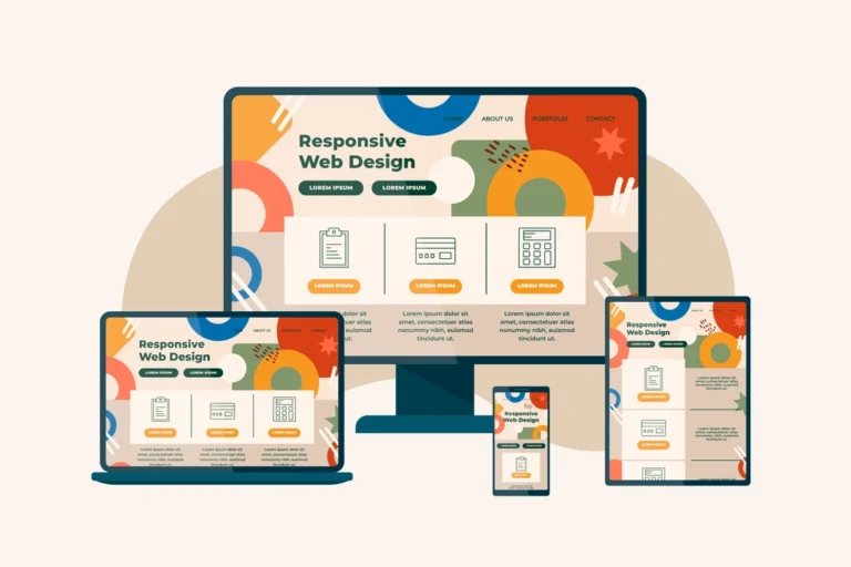
Responsive design is an approach to web design that makes web pages render well on a variety of devices and window or screen sizes. It employs flexible grids, layouts, images, and CSS media queries to adapt to different screen sizes.
Importance of Responsive Design
Improved User Experience: Ensures a consistent and enjoyable experience across all devices.
Increased Accessibility: Makes content accessible to a broader audience, including mobile users.
SEO Benefits: Google favors mobile-friendly websites, improving search engine rankings.
Key Principles of Responsive Design
Fluid Grids: Use relative units like percentages instead of absolute units like pixels.
Flexible Images: Ensure images scale appropriately within their containing elements.
Media Queries: Apply different styles based on the device characteristics such as width, height, and orientation.
Benefits of Responsive Design in UI/UX
Enhanced Usability:Responsive design provides a seamless experience by ensuring that websites and applications look and function well on any device. This adaptability reduces bounce rates, as users are less likely to leave due to poor navigation or layout issues.
Future-Proof:Responsive design is inherently future-proof, adapting to new devices and screen sizes without requiring additional design work. As new technologies and devices emerge, a responsive site can accommodate these changes seamlessly.
Cost-Effective:Responsive design is cost-effective as it eliminates the need to create and maintain separate versions of a site for mobile and desktop users. By using a single, responsive design, businesses can save on development and maintenance costs.
Conclusion
Responsive design is essential for modern UI/UX design, ensuring that websites and applications provide a seamless experience across all devices. By adhering to responsive design principles, designers can create adaptable and user-friendly interfaces. This approach not only enhances usability but also future-proofs the design, allowing it to remain effective as new devices and technologies emerge. Furthermore, responsive design is cost-effective, reducing the need for multiple site versions and simplifying maintenance.